.png)
Data Sources: 2018-2022 American Community Survey and the U.S. DOE’s Low-Income Energy Affordability Data (LEAD) Tool, accessed 10/17/2025
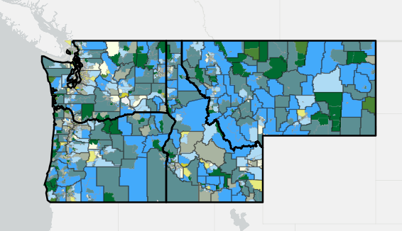
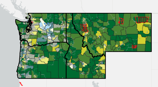
This map shows the percentage of individuals in Northwest communities living at or below 150% of the federal poverty line ($41,625 in 2022), paired with average energy burden (percentage of annual household income spent on energy costs).
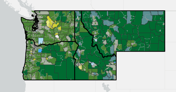
Oregon has the highest average percentage of individuals living at or below 150% of the federal poverty line, at 24%. Idaho and Montana are comparable with averages of 25%, and Washington has the lowest average percentage at 19%.
There are also essential differences in energy burden among Northwest communities. For instance, Montana's energy burden is twice that of Washington’s (5.1% and 2.5%, respectively). Meanwhile, Idaho and Oregon’s energy burden falls between the two, at 4.1% and 3.4%.
This means that for a family making the median household income in 2024 in the United States ($83,730), their average annual energy bill in Montana would be $4,270, compared to $3,433 in Idaho, $2,847 in Oregon, and $2,093 in Washington. Notably, the costs associated with energy bills are often made more significant by compounding socioeconomic challenges, such as increased housing burden and fewer economic opportunities.
Click on the "i" in the upper left-hand corner to open the map legend. Use the options in the lower right-hand corner to open in ArcGIS map viewer, view in full screen, search for an address, return to the default zoom view, and zoom in and out. Click on the map to see associated data.
The map is divided into census tracts, which are color-coded to show the community-level relationship between poverty and energy burden. Black lines indicate counties, and red lines indicate Tribal Lands.
The darkest green (top center square in the legend) indicates communities with high percentages of individuals at or below 150% of the federal poverty line and high average energy burden.
The blue (right corner square) indicates communities with high proportions of individuals at or below 150% of the federal poverty line but low average energy burden, and the light green (left corner square) shows the opposite (low proportions of individuals at or below 150% of the federal poverty line but high average energy burden).
Lastly, the light yellow (bottom center square) shows areas that have low percentages of both individuals at or below 150% of the federal poverty line and energy burden.
Note: The white area between Yakima County and Franklin County is Hanford, a decommissioned nuclear production site where no one is permitted to live within 35 miles.