.png)
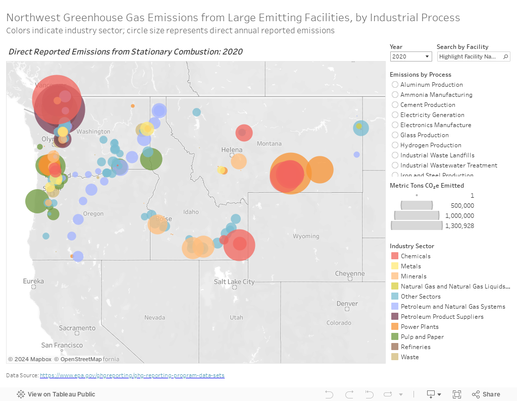
This visualization shows greenhouse gas emissions from large emitting facilities in the Northwest in 2019 and 2020. Note that the 2020 data reflect COVID-19’s impact on energy use and consumption.
The EPA defines a "large emitting facility" as one that emits 25,000 metric tons or more of carbon dioxide equivalent (CO2e) per year. These facilities are required to report emissions to the EPA through the Greenhouse Gas Reporting Program (GHGRP).
The emissions in this visualization are broken down by industry sector (type of facility) and industrial process. This map shows both the stationary combustion emissions (from the combustion of a fossil fuel or biomass feedstock) and process emissions (from the chemical transformation of raw materials during the industrial process) that the facility reports. The total direct reported emissions are equal to the sum of the industry’s stationary combustion emissions plus the emissions from the process pertaining to that industry.
Industrial facilities are energy-intensive. Several require high temperatures to effectuate chemical transactions; the facilities themselves require a lot of energy to operate; and for some processes energy resources are required to directly create the industrial product. The EPA provides Sector Data Highlights for each industry as well as an Overview of Greenhouse Gases.
For further reading, explore the Clean Energy Transition Institute's projects on industrial decarbonization and blog post about the industrial emissions maps.
Hover your mouse over the circles to see information about each facility and click for more options.

Click on the "reset" button (fourth from the right in the bottom right-hand toolbar) to return to the original view. To learn about interacting with the visualizations, visit Tableau Tips.
Each circle on the map represents a large emitting facility and is color-coded to show the industry sector. The circle size represents the amount of annual emissions that the facility reported. Filter by industrial process, industry sector, year, and facility by using the menu on the right.
Note: Keep in mind that the scale adjusts when a filter is applied. The resulting scale is relative to the other elements within that filter and is shown in the legend on the right.


