.png)
Tableau Tips: How to Interact with Visualizations
General
The Tableau visualizations contain interactive features that allow you to filter to explore different facets of the data. When you click on a visualization, you will isolate that data point. Click again to unselect the data point or use the “reset” button in the bottom righthand corner to return to the original view.

Every Tableau visualization has a toolbar in the bottom righthand corner that you will want to familiarize yourself with. You may have to scroll or decrease the zoom to see this toolbar.
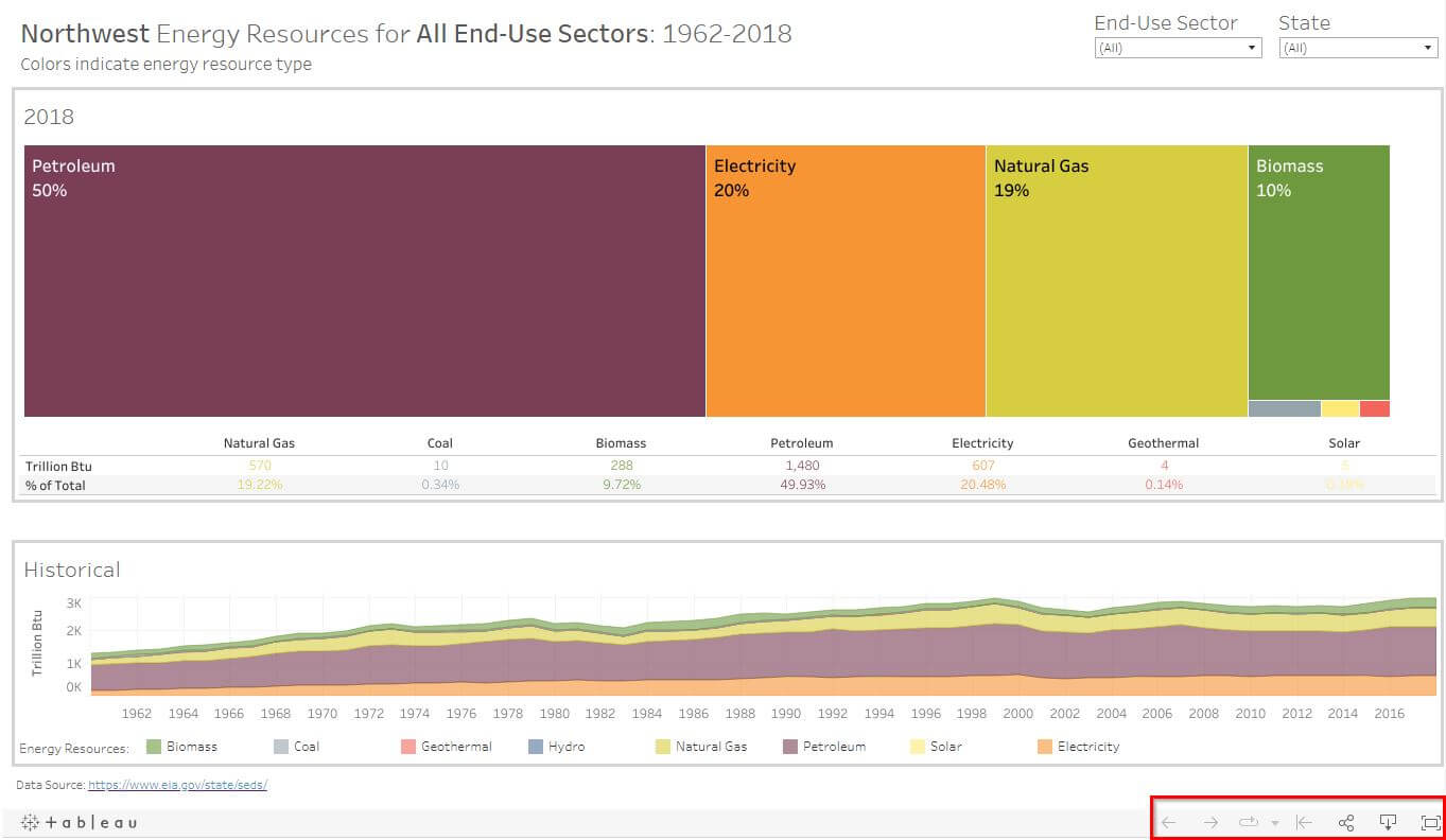
Using this toolbar, you can:


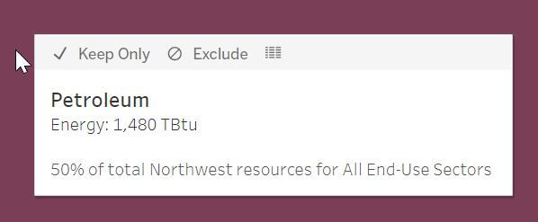
As you hover your mouse over a visualization, you will see text boxes that reveal details about each data point.
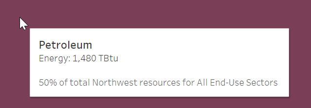
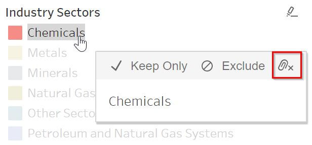
When you click on the data point, the text box will reveal three options:
- Keep Only: Show only this data point in the visualization.
- Exclude: Remove this data point from the visualization. If showing percentages, this option will recalculate new percentages with the remaining data
- View Data: Opens the data in a new window with the option to download as a text file
If you wish to select more than one data point at the same time, use ctrl + click. In the example below, you can see that Petroleum, Natural Gas, and Biomass are all selected.
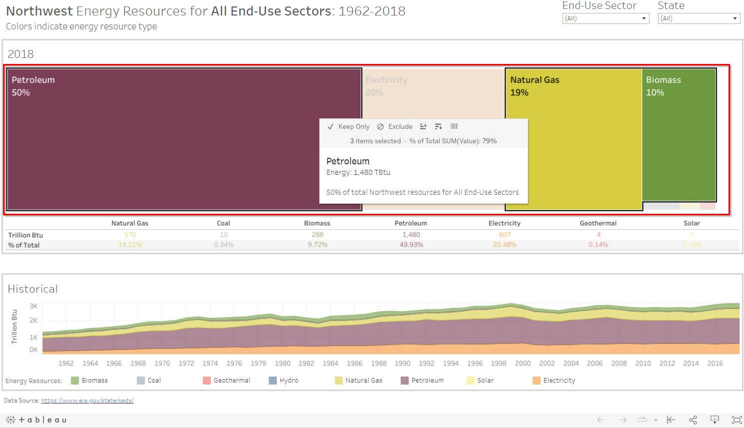
Treemaps
Treemaps are visualizations that show hierarchical data with a series of nested rectangles of sizes proportional to the corresponding data value. In the treemap visualizations, you will see dropdown menus with filters in the upper right-hand corner.
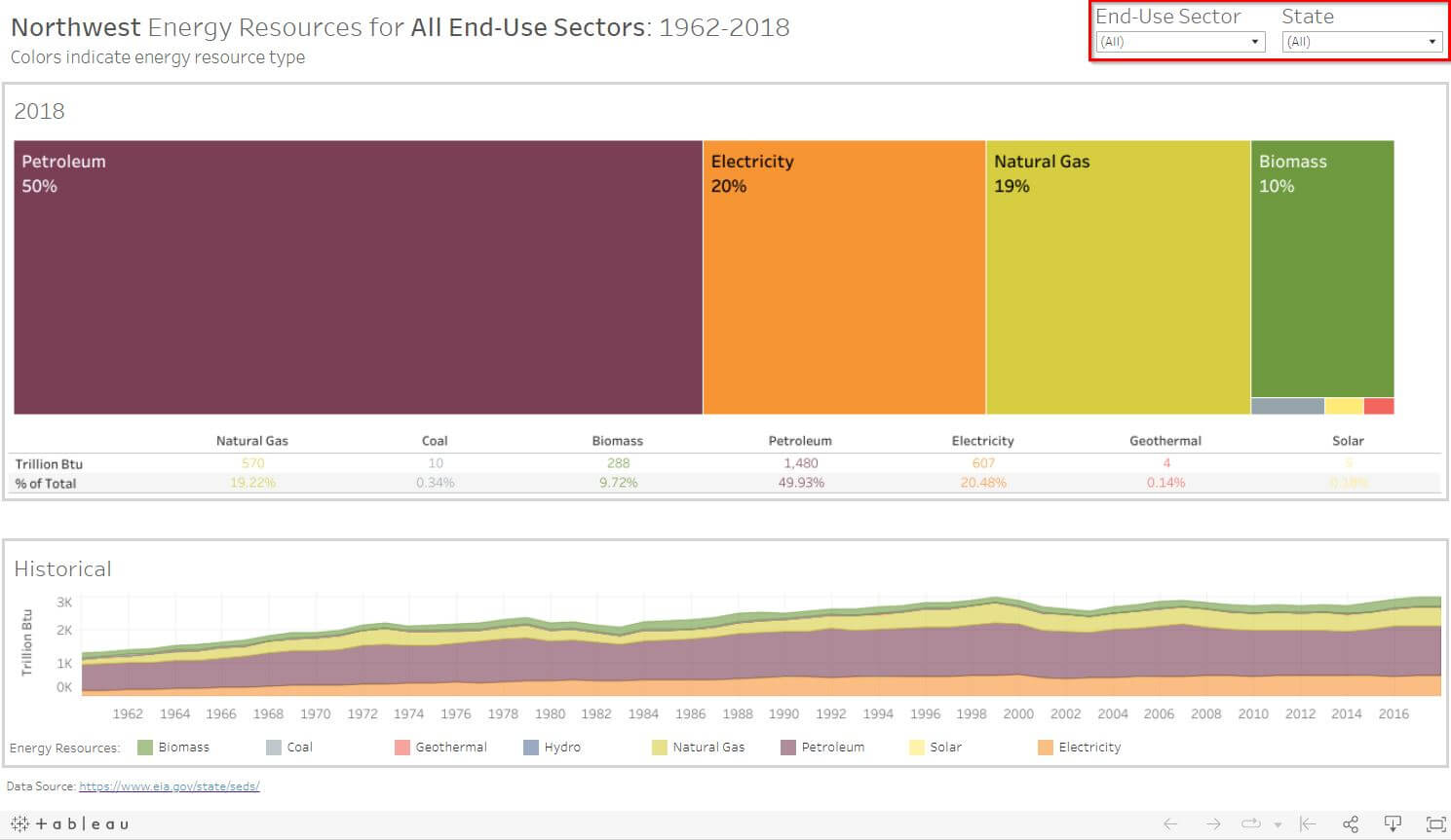
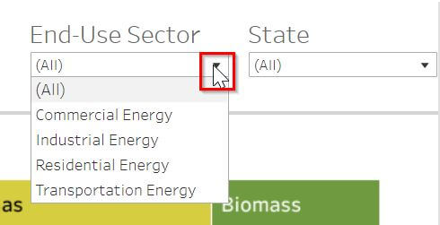
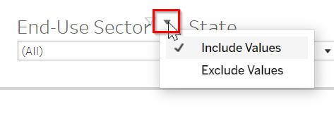
Click on the down arrow from each menu to choose from the list. Your choice will filter for that data and change the visualization.
When filtering, you can choose if you want to filter by including or excluding the selected data. Right-click anywhere in the legend for these options or click on the down arrow near the legend title.
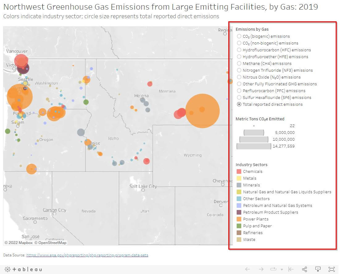
Maps
On the map visualizations, you can filter for data using the legends located below or to the right of the map.
In some legends, you can either choose a single value or multiple values. Right-click anywhere in the legend for these options or click on the down arrow near the legend title.
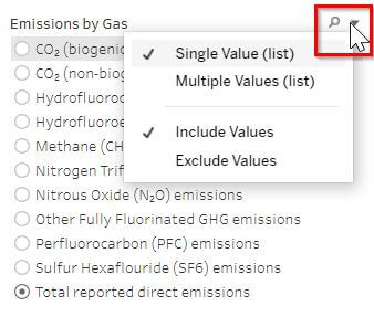
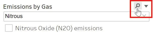
You can also use click on the magnifying glass and search for a specific filter within the list.
When available, click on the paper clip to ungroup sections of a legend.
To change the map view, move your mouse to the upper left-hand corner to reveal a toolbar.
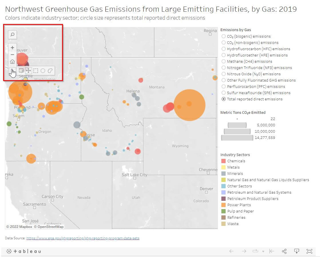
Using this toolbar, you can: